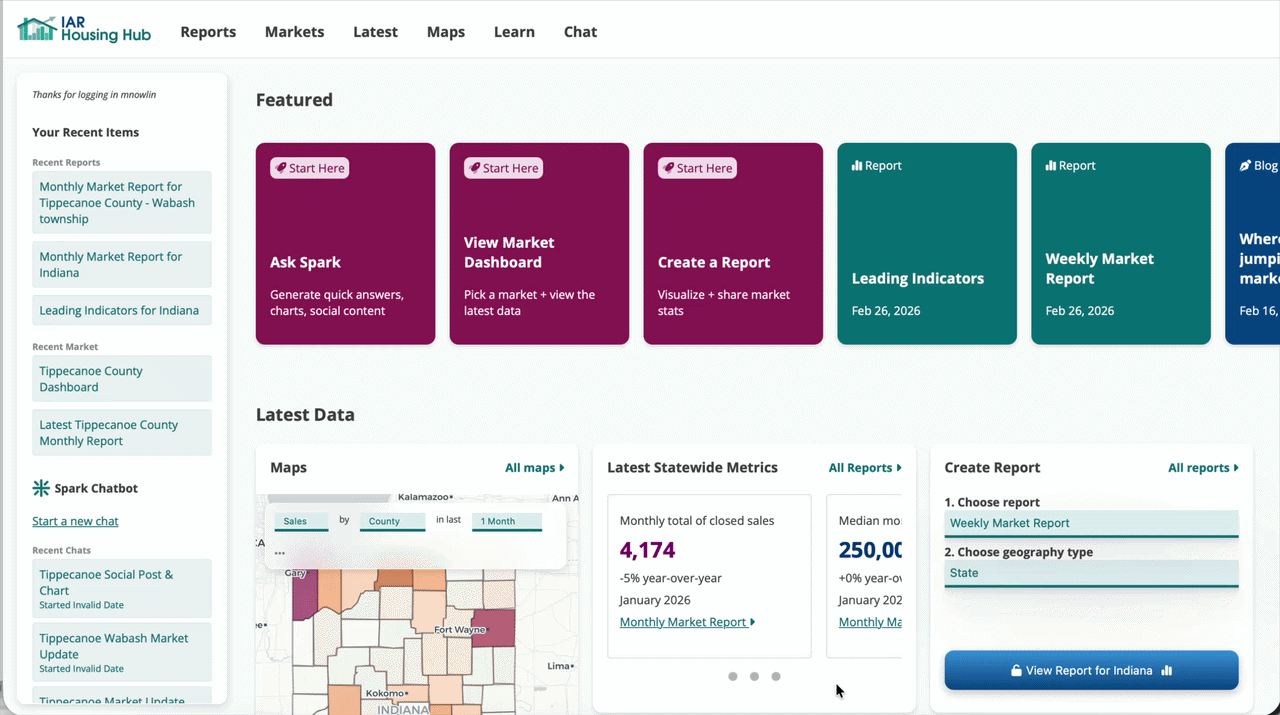
5 Min.
Preview
Find what changed this week
Load a market dashboard and look for an interesting trend in the insight cards.
Preview: Search county → open dashboard → view weekly insights
Generate a chart
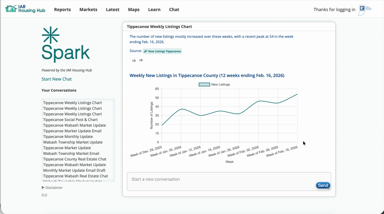
The default chart was okay, but let's build one that focuses just on the last few weeks.
Preview: Ask Spark for chart
Export the chart and generate a caption
Pick the optimal size for your platform, and use the generated captions as a starting point.
Preview: Download chart → generate caption
How to do it
When to use this
- Monday morning check-ins
- Big week-over-week changes
- Staying visible without writing a newsletter
Steps
- Search for your county and open the dashboard.
- Click an insight to open the underlying chart.
- Ask Spark for a specific weekly view if needed.
- Download the chart and paste it into a social post.
- Spark can generate caption ideas, too.
Why this works
Weekly updates don’t need depth—they need consistency.
One clear chart and one sentence of context is enough to signal that you’re paying attention.
Over time, this builds credibility without overwhelming your audience.
Pro tip
Find a trend that stands out, but make sure the change is not just weekly noise.
Create this post →