Let a single chart carry the message and add one clear takeaway line.
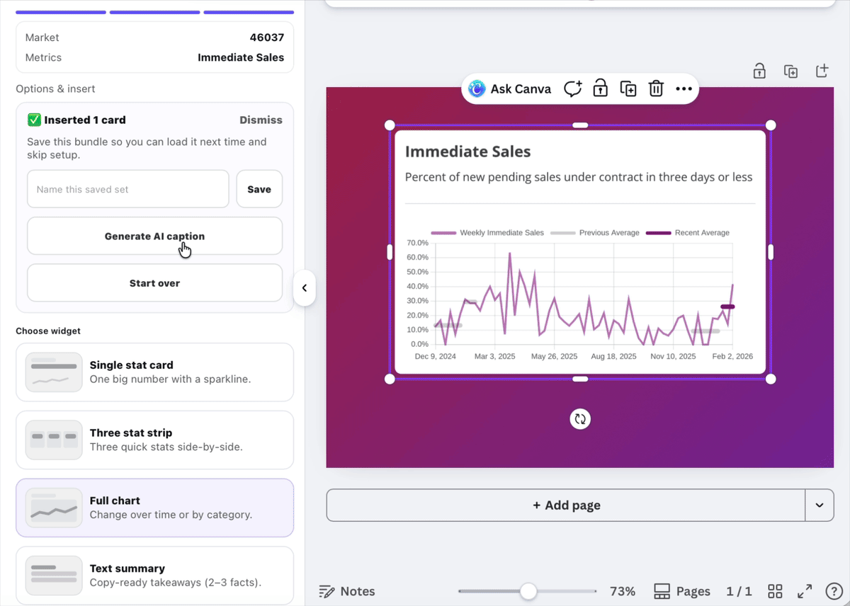
When one number tells the story, adding more metrics only adds noise. A single chart keeps the message focused and makes the takeaway obvious at a glance.
This format works especially well for Instagram, LinkedIn, and email newsletters, where clarity matters more than density.
Use this format for recurring metrics like median price or inventory. Repeating the same chart month over month makes trends easier to recognize.