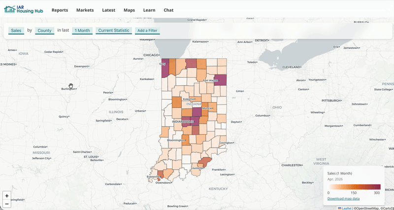
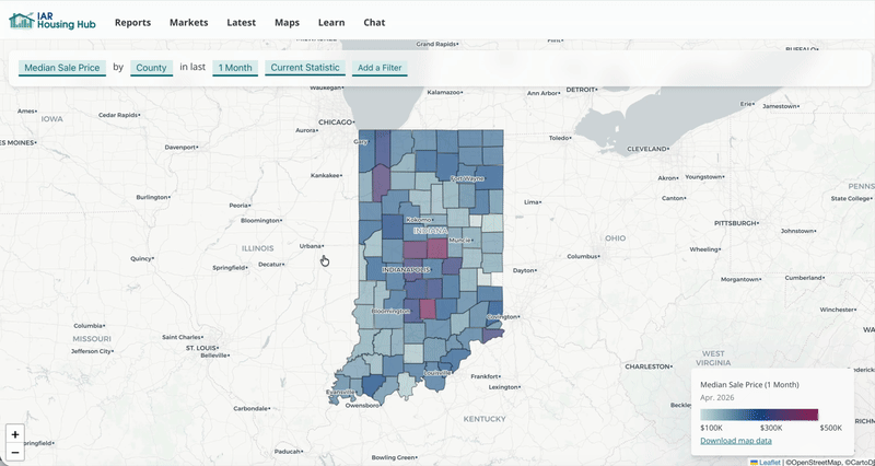
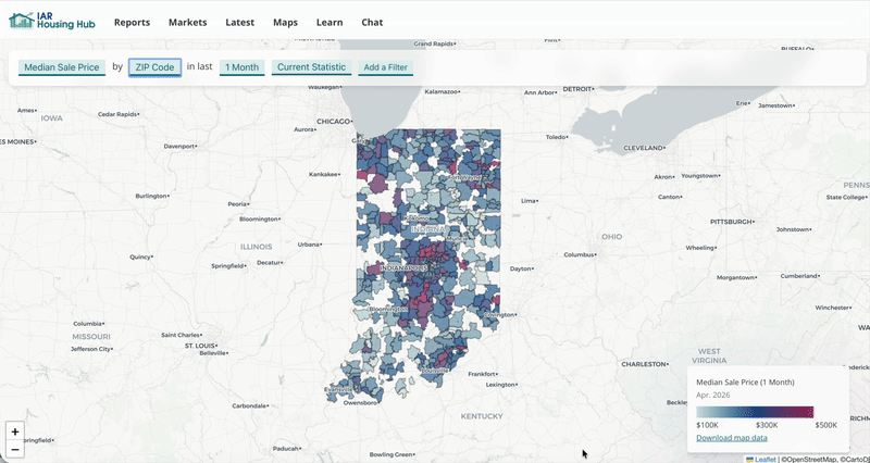
Explore interactive maps
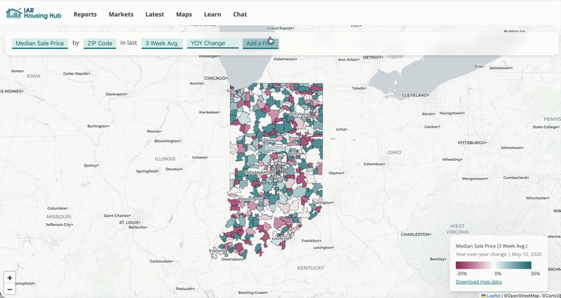
The legend shows what each color means. Click a place to see the exact value in that location.
This changes the boundaries on your map. Some small areas without enough data will appear blank.
For more recent data, the average of the last three weeks show you current trends. For a long-term view, choose 3-month or 12-month averages.
You can switch the map to year-over-year comparison. Now the map shows percent change compared to the same time period one year ago (no matter what time period you've selected).
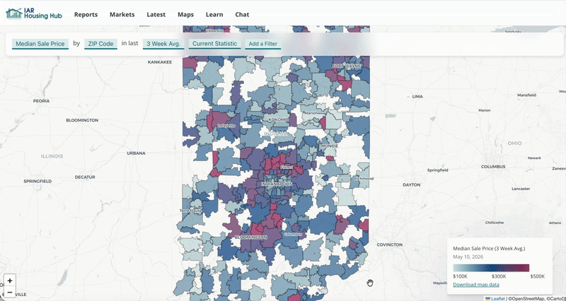
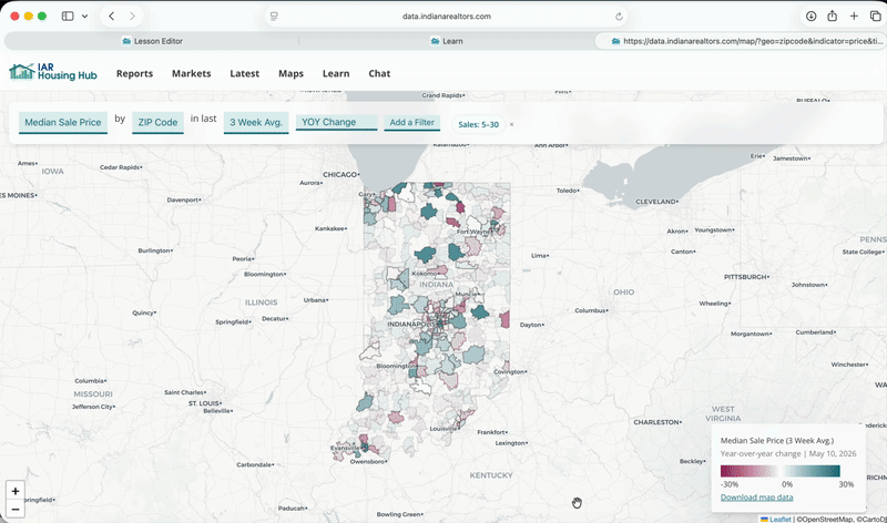
ZIP Codes can be noisy, especially for weekly data. Let's filter to see only ZIP Codes with at least 5 sales per week in our selected time period (three-week average).
Now we're seeing the year-over-year change in median sale price for ZIP codes with at least 5 sales per week in the last three weeks.
The URL stores all the options you chose. Copy and share this URL. When someone opens it, they will see exactly the map you created.
Looking at spatial data helps you spot big-picture patterns, like where sales and inventory are growing.
You can save your map as a PDF by printing the page (File > Print) and selecting the PDF options.