Map a chart to see how it compares across the state
Map it good! When you're viewing a chart in a report for the state, a county, a ZIP Code, or a township, you can map that indicator.
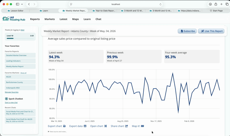
We've mapped sale-to-list ratio. Because we were looking at a county report (Adams County) we see a county map.
The three facts that are usually above each chart are available as three map variants. Select from the dropdown menu above the map.
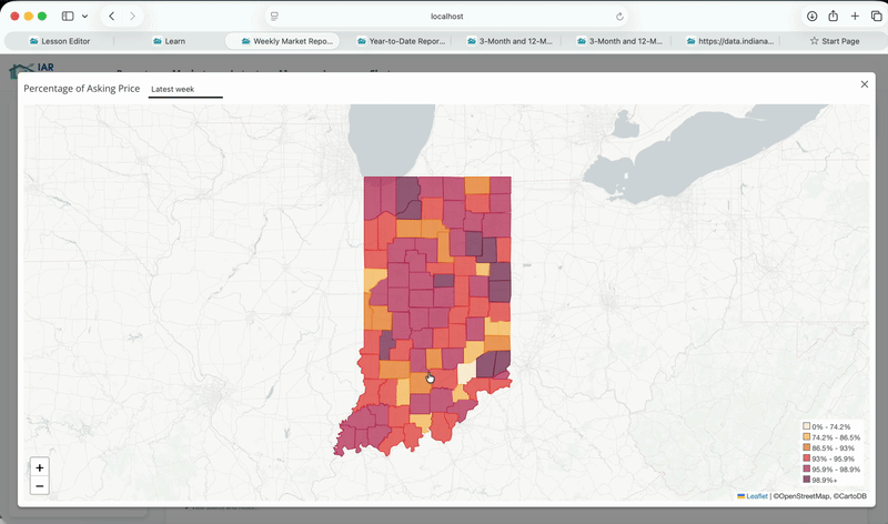
The geography your viewing in your report (for example, a county) determines the kind of map you'll see. On a statewide report, you will see a county map.